How to make Responsive Images with Radicle?

I am using Radicle for my WordPress theme and want to know how to implement responsive images.

I tried using the responsive plugin that was linked in another discussion, but it’s not working for me as I don’t understand how that plugin works, unfortunately.

Responsive Pics Plugin

I looked into the Radicle documentation but couldn’t find anything.

For context, I am coming from a Next.js background where we would simply use the sizes attribute in the HTML, and the Next.js Image component would handle all the srcset generation and image optimization. Is there anything I can do with Laravel to replicate the same outcome? What do you guys think?

You shouldn’t need a plugin to get the kind of responsive behavior you’re talking about in your Next.js background. It’s built in to WordPress core.

When you get an image from WordPress (using wp_get_attachment_image(), get_the_post_thumbnail(), etc), the HTML sizes and srcset attributes will automatically be generated. (You can also manually pass sizes and srcset in the $attr array if you did decide to define them yourself)

The Radicle-specific piece of this puzzle is where to define custom image sizes if you need something beyond the WordPress defaults. You can define any custom image sizes you need under the image_sizes key in config/theme.php.

2 Likes

Hi Hatim,

I’m one of the authors of the Responsive Pics Plugin , what is that you don’t understand about the plugin, maybe I can help?

The plugin basically does the srcset generation for you directly from your blade templates, like in Next.js or Cloudinary, but instead in the WP uploads folder.

Wordpress only has 4 default image sizes. In modern designs this is normally not enough, but you also don’t want every custom image size to be applied for each upload, therefore we created functions to only resize and/or crop a specific media library item from your templates:

{!! ResponsivePics::get_image(id, sizes, crop, classes, lazyload, lqip) !!}
{!! ResponsivePics::get_picture(id, sizes, classes, lazyload, intrinsic) !!}
{!! ResponsivePics::get_background(id, sizes, classes) !!}

This only works in your blade/php templates, unfortunately it’s harder to implement this in Gutenberg blocks, but it can be done using the Rest API endpoints in your React components :

/wp-json/responsive-pics/v1/image/<id>?sizes=<sizes>&crop=<crop>&classes=<classes>&lazyload=<lazyload>&lqip=<lqip>

Hope this clears things up a bit!

2 Likes

@Twansparant and @thunderdw, thank you for your responses. Unfortunately, I’ve encountered some issues with both methods.

  1. The plugin only generates 3 srcsets that I cannot control myself; I would like to at least have 6 srcsets. Moreover, it does not respect the image styling I already have in place for the images, when I use it, it either make smaller images or the images don’t show on the viewport, I think theres some styling that comes with the plugin.

  2. The other method suggested by @thunderdw works well, but WordPress only generates srcsets smaller than the original image (e.g., 2000px) and fails to scale them up for bigger screens.

Here’s a snippet from my Radicle Theme.php configuration:

And here’s the rendered HTML:

At this point, I’m considering creating a basic custom plugin that offloads the heavy lifting to Cloudflare (I’ve tried other CF plugins and faced similar issues). Unfortunately, these plugins also generate their own srcsets, which are hard to control.

Do you know if Laravel has an equivalent of Image Components? Or is there something in Radicle that I’m not aware of?

Thanks for your help!

Hmm, that doesn’t sound right. The whole point of the plugin is that you DO have control over the srcsets. It can take some time before the images are generated depending on your cron interval (default is 15 mins) since the resizing is done as a background process with Action Scheduler.

Besides that, no styling whatsoever is applied on images (it doesn’t even have a css file for the frontend). If the images seem smaller, then either not all sizes have been generated yet, or you have to tweak the function parameters.

So it’s a skill issue, I blame php syntax :sweat_smile: .

So let’s say I want to instruct the plugin to give me the following srcset, how to do that?:

256×144, 
750×422, 
1190×670, 
1500×844, 
1800×1013, 
2048×1152

Is it like this?

<?= ResponsivePics::get_image(1, '256×144, 750×422, 1190×670, 1500×844, 1800×1013, 2048×1152'); ?>

You can’t ONLY generate the srcset with the plugin, it’s always in combination with the sizes attribute: Documentation - Automatic image resizing for Wordpress theme authors

So let’s say, you want:

256×144  for (min-width: 0px)
750×422 for (min-width: 576px)
1190×670 for (min-width: 768px)
1500×844 for (min-width: 992px)
1800×1013 for (min-width: 1200px)
2048×1152 for (min-width: 1400px)

You could use:

<?= ResponsivePics::get_image(1, 'xs:256 144, sm:750 422, md:1190 670, lg:1500 844, xl:1800 1013, xxl:2048 1152'); ?>
1 Like

Something like this should work

Your function for the responsive images

function custom_responsive_image($image_id, $breakpoints, $custom_class = '') {
    // Initialize srcset and sizes strings
    $srcset = [];
    $sizes = [];

    // Loop through the breakpoints to build the srcset and sizes arrays
    foreach ($breakpoints as $breakpoint => $size) {
        $image_src = wp_get_attachment_image_src($image_id, $size['size']);
        if ($image_src) {
            $srcset[] = $image_src[0] . ' ' . $image_src[1] . 'w';
            $sizes[] = "(min-width: {$breakpoint}px) {$image_src[1]}px";
        }
    }

    // Get the alt text for the image
    $alt_text = get_post_meta($image_id, '_wp_attachment_image_alt', true);
    $alt_text = !empty($alt_text) ? $alt_text : 'Fallback alt text';

    // Combine srcset and sizes arrays into strings
    $srcset_string = implode(', ', $srcset);
    $sizes_string = implode(', ', $sizes);

    // Get the smallest image as the default src
    $default_image = wp_get_attachment_image_src($image_id, $breakpoints[min(array_keys($breakpoints))]['size']);

    // Return the image HTML
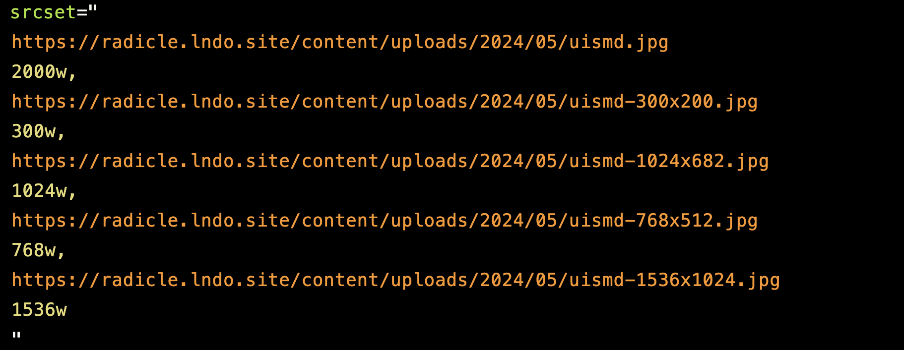
    return '<img src="' . esc_url($default_image[0]) . '" class="' . esc_attr($custom_class) . '" srcset="' . esc_attr($srcset_string) . '" sizes="' . esc_attr($sizes_string) . '" alt="' . esc_attr($alt_text) . '">';
}

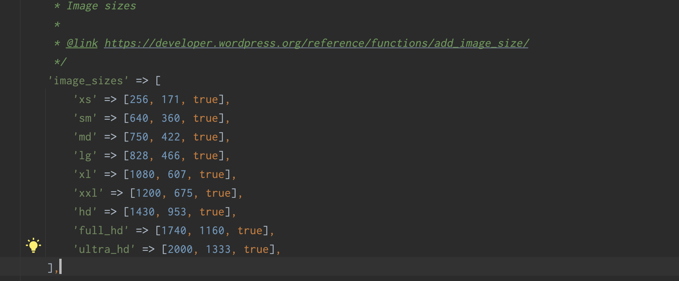
Register your custom image sizes

function my_custom_image_sizes() {
    // Add custom image sizes
    add_image_size('256x144', 256, 144, true); // For min-width: 0px
    add_image_size('750x422', 750, 422, true); // For min-width: 576px
    add_image_size('1190x670', 1190, 670, true); // For min-width: 768px
    add_image_size('1500x844', 1500, 844, true); // For min-width: 992px
    add_image_size('1800x1013', 1800, 1013, true); // For min-width: 1200px
    add_image_size('2048x1152', 2048, 1152, true); // For min-width: 1400px
}
add_action('after_setup_theme', 'my_custom_image_sizes');

to use it in your theme

<?php
$image_id = get_post_thumbnail_id();
echo custom_responsive_image($image_id, array(
    0 => ['size' => '256x144'],
    576 => ['size' => '750x422'],
    768 => ['size' => '1190x670'],
    992 => ['size' => '1500x844'],
    1200 => ['size' => '1800x1013'],
    1400 => ['size' => '2048x1152']
), 'image--responsive);
?>
1 Like